Have you visited our portal at support.deskpro.com recently? If so, you'll have noticed that it has a shiny, modern new look.
That's because we've updated it to the new DeskPRO portal system. It's not just a cosmetic update; the new portal has lots of new features and improvements which our developers have worked hard to build, based on your feedback and suggestions.
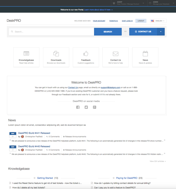
Of course, we're not going to keep this update to ourselves for long. Soon, you're going to be able to use the new portal system on your own helpdesk.
Let's go through the many benefits of the new portal.
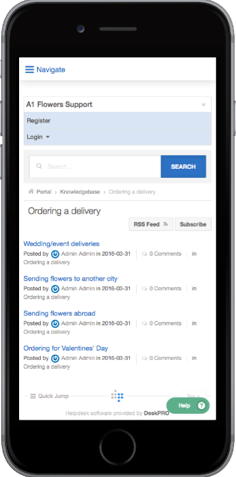
Responsive design looks great on all devices
The old portal didn't always look great on smaller screens, like smartphones. We've redesigned the new portal from the ground up to use responsive design: in other words, the layout will change to fit whatever device you're viewing it on, whether that's a phone, a tablet, a small laptop or a giant monitor.
More informative ticket view for users
Not only does the new portal look better, but it's designed to deliver a better experience for your users.
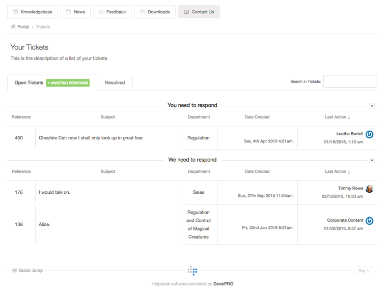
Here's an example: now, when a user logs in, they will be notified of any new agent replies at the top of the portal.

The list of all a user's tickets also indicates more clearly when a ticket needs a response, as well as providing a lot more information about each ticket at a glance.
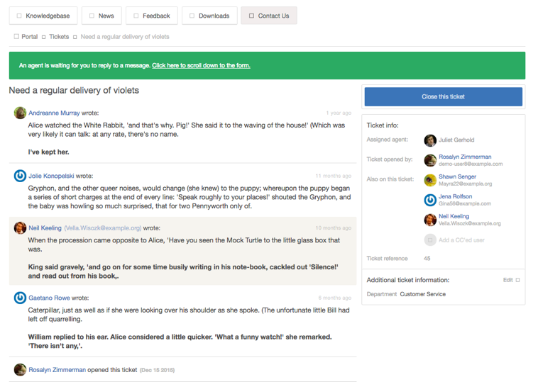
The view of an individual ticket has also been greatly improved. Now the user can change who is CC'd in to a ticket after it has been created.
More useful portal search
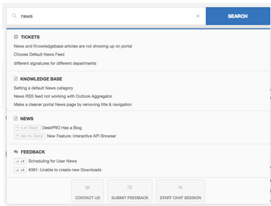
In the old portal, when you searched the portal as a user, the results included all types of portal content mixed together: News posts, Knowledgebase articles, Feedback items, and so on.
If your search term just happened to match a lot of News posts, they would dominate the search results - even if what you were looking for was a Knowledgebase article.
Now with the new system, different types of portal content are shown in separate sections, so it's easy to find the type of content you need.
You'll notice that search now includes the user's own tickets.
Easier, more powerful portal editor
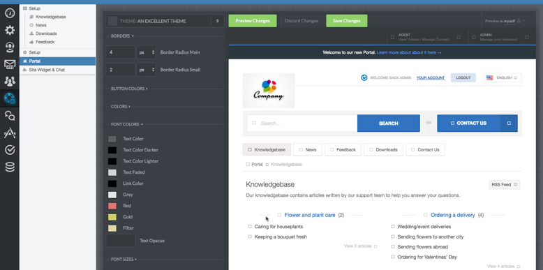
We've redesigned the portal editor to give you finer control of exactly how your portal looks. Now you can edit details like font size and element positioning without needing to be a web designer, so it's easier to style your portal to fit with the rest of your brand.
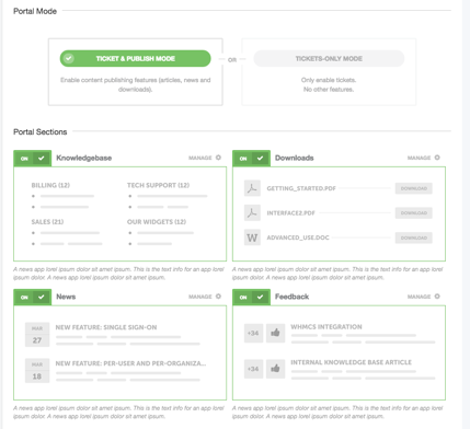
We've moved the controls to turn sections of the portal on and off to a separate page, outside of the portal editor.
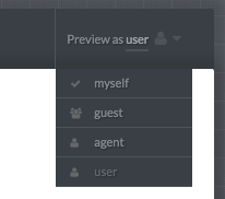
If you're taking advantage of DeskPRO's usergroup system to present different portal content to different users, you'll find you can easily preview what the portal will look like to any group.
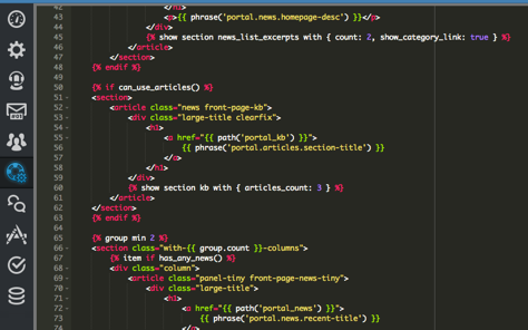
If you do need to customise the portal at a deeper level, you still have the option to edit the portal templates. You'll find the new template system simpler and easier to understand, and the editing experience has been greatly improved with the addition of color syntax highlighting and auto-complete.
More abuse prevention options
Are wild spam robots submitting junk tickets and comments into your portal, wasting your time? The old portal had a bunch of options to prevent this with "enter these letters" CAPTCHA tests and rate limits. In the new system, you'll find we've put all the settings about this together in one convenient location.
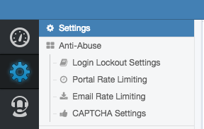
We've also added the option to use Google's reCAPTCHA system, which can verify most humans without even needing them to complete a CAPTCHA challenge at all.
Improved ticket form
Submitting a new ticket from the portal is greatly improved.
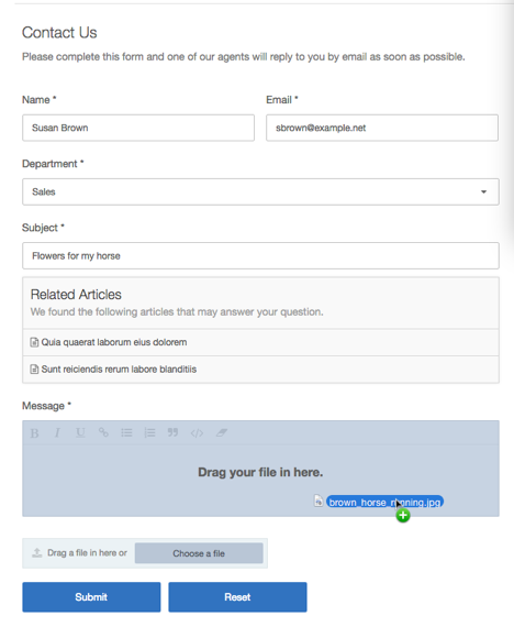
All the input is stored as you type - just like in the agent interface - so if a user's browser crashes or they accidentally close the tab, they can continue right where they left off.
Users can drag and drop attachments to add them to a ticket, and even paste images straight into the ticket message - just like your agents can.
Better news for everyone
We've added the ability to provide translations for News posts, as you can for other portal content. Users can request email notifications when you publish posts, alongside the existing RSS feed option.

More engaging chat
By popular demand, we've added a great new "pro-active" chat feature which allows you to offer a greeting to your users or ask them a question, before they initiate a conversation with you.
This is a great way to make your customers who are looking for support feel that you're eager to help!
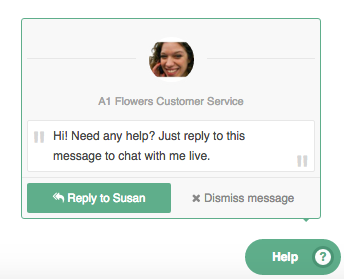
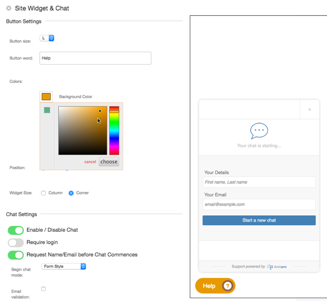
While we were improving chat, we also added an easy-to-use editor which allows you to customise how the chat widget looks and behaves. You can change the size and wording of the chat button, use custom colors, change the position and size of the chat window, and more.
Over to you
If you want to get a feel for how the new portal is better, please check out support.deskpro.com. If you spot any glitches, or have any questions about how the new portal will work on your helpdesk, email us right away at support@deskpro.com.


Comments (5)