


When building dashboards in Deskpro, one of the most important decisions is how to display your data.
The type of widget you choose determines how information is interpreted and how quickly users can draw insights.
This guide explains when to use each widget type, how it visualizes data, and includes sample DPQL queries with real examples.
Simple Stat – Display a Single Key Metric
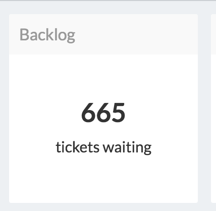
A Simple Stat widget displays one key value, such as a total, count, or percentage.
Use this type when you want to emphasize a single KPI.
SELECT DPQL_COUNT() AS 'stat_value',
       'Tickets waiting' AS 'stat_description'
FROM tickets
WHERE tickets.status IN ('awaiting_agent', 'awaiting_user')
You can customize the display further with:
unit_leftorunit_rightadd a currency or symbol (e.g. £ or %).default_valueset a fallback value if the query returns none.
Example:
'%' AS 'unit_right',
'0' AS 'default_value'
DPQL example:
SELECT DPQL_COUNT() AS 'stat_value',
       'Tickets waiting' AS 'stat_description',
       '%' AS 'unit_right',
       '0' AS 'default_value'
FROM tickets
WHERE tickets.status IN ('awaiting_agent', 'awaiting_user')
Use this widget when:
Showing total open tickets
Displaying average response or resolution times
Tracking SLA performance percentages
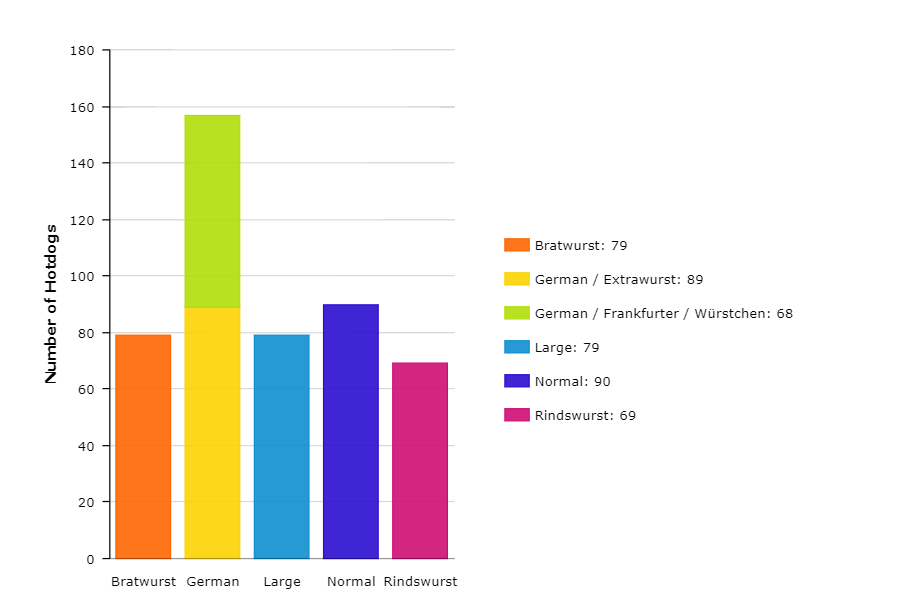
Bar and Line Charts – Compare or Track Data Over Time
Bar charts and line charts are the versatile display types.
They are ideal for comparing categories or showing trends across time periods.
SELECT DPQL_COUNT() AS 'Number of Hotdogs'
FROM tickets
WHERE tickets.organization <> NULL AND tickets.custom_data[24] <> NULL
GROUP BY DPQL_HIERARCHY(tickets.custom_data[24], 1, 3) AS 'Type'
This query groups ticket data using the DPQL_HIERARCHY() function.
It aggregates nested custom field options, for example, grouping all sub-types under “German”.
Use this widget when:
Comparing ticket volume by department or agent
Tracking performance over time
Displaying SLA compliance trends
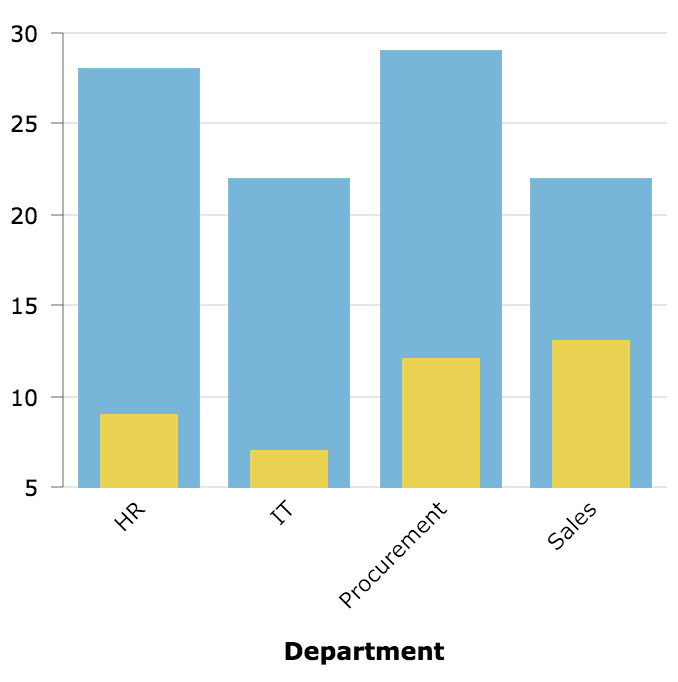
Layered Charts – Compare Multiple Datasets in One View
Layered charts allow you to combine multiple result sets in a single visualization using the LAYER WITH keyword.
This is useful when comparing related metrics, such as open and closed tickets per department.
SELECT
    DPQL_COUNT() AS 'Open Tickets',
    tickets.organization.name AS 'Department',
    'Tickets' AS 'value_axis_title'
FROM tickets
WHERE
    tickets.organization.name <> NULL
    AND tickets.status IN ('awaiting_user', 'awaiting_agent')
GROUP BY tickets.organization.name AS 'Department'

LAYER WITH

SELECT
    DPQL_COUNT() AS 'Closed Tickets',
    tickets.organization.name AS 'Department'
FROM tickets
WHERE
    tickets.organization.name <> NULL
    AND tickets.status = 'resolved'
GROUP BY tickets.organization.name AS 'Department'
You can also use LAYER WITH LINE to combine chart types, for example, bars for totals and a line for targets.
Use this widget when:
Comparing two or more datasets with the same categories
Showing changes in open vs. closed or inbound vs. resolved counts
Avoid using when: only a single metric is being displayed, or when datasets differ significantly in scale.
Pie Charts – Show Proportions of a Whole
A Pie chart displays how each part contributes to a total.
It’s most effective when you have a limited number of categories to compare.
SELECT DPQL_COUNT() AS 'Tickets', tickets.status AS 'Status'
FROM tickets
GROUP BY tickets.status AS 'Status'
Use this widget when:
Showing ticket distribution by status or channel
Comparing the share of resolved vs. pending tickets
Avoid using when: you have more than 5–6 segments or when categories have similar values.
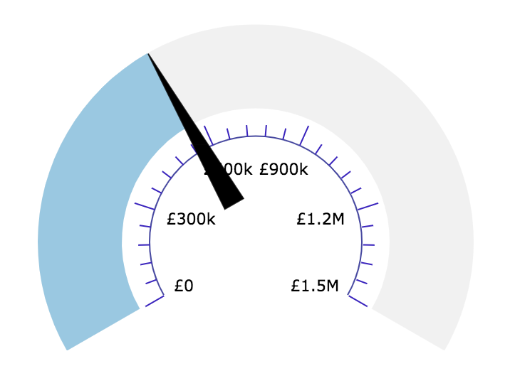
Gauge Widgets – Measure Performance Against a Target
A Gauge widget is useful when you need to visualize progress toward a specific target, such as SLA compliance or total revenue.
SELECT SUM(ticket_charges.amount) AS 'stat_value',
       1500000 AS 'stat_total',
       DPQL_CONCAT('£', DPQL_FORMAT(SUM(ticket_charges.amount), 'number', 0),
                   ' of £1.5M budget') AS 'tooltip_text'
FROM ticket_charges
WHERE ticket_charges.ticket.date_created = %THIS_YEAR%stat_valuedetermines the current position of the needle or fill.stat_totaldefines the maximum range.tooltip_textadds context for the displayed value.
Use this widget when:
Comparing progress against a set goal or budget
Tracking utilization rates or performance thresholds
Avoid using when: you need to compare multiple categories or historical data.
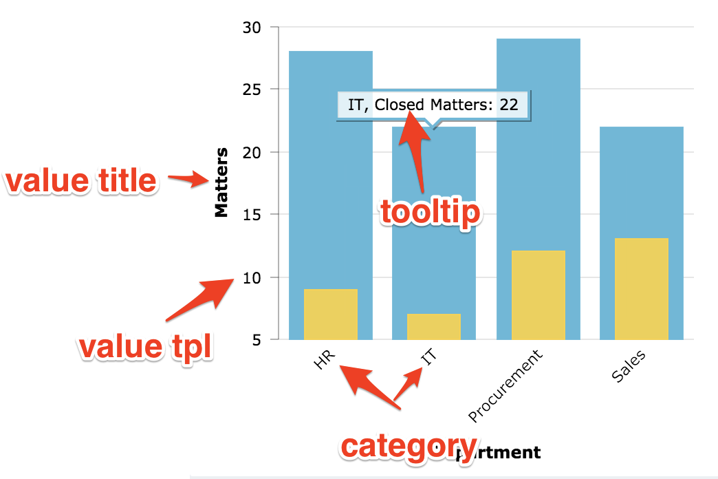
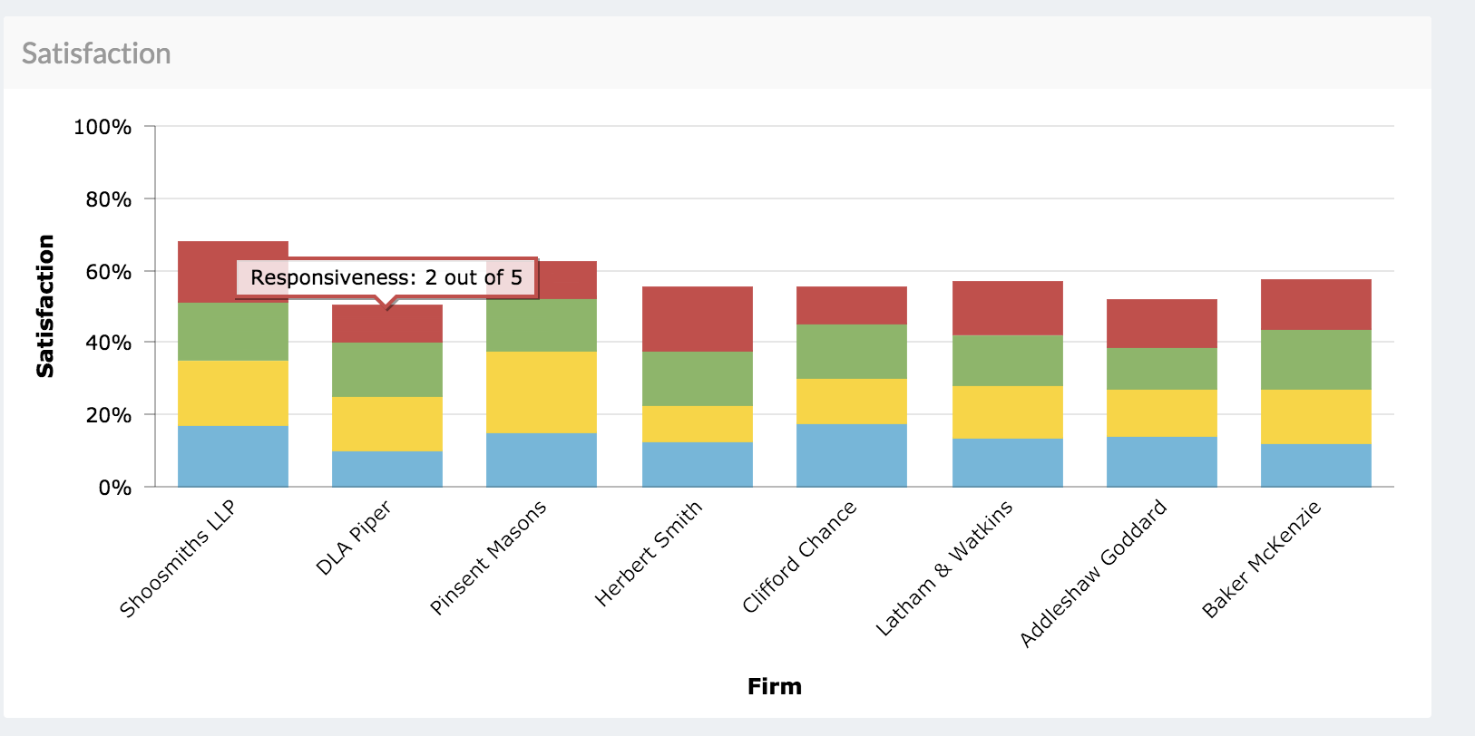
Tooltips and Templates – Enhance Readability
Tooltips and templates provide a way to customize axis labels, tooltips, and values for clearer visualization.
SELECT AVG(tickets.custom_data[rate_responsiveness])*5 AS 'Responsiveness',
       'Responsiveness: {{formatNumber (math value "/" 5) minimumFractionDigits=0 maximumFractionDigits=1}} out of 5' AS 'tooltip_text_template'
FROM tickets
WHERE tickets.custom_data[rate_responsiveness].value <> NULL
  AND tickets.custom_data[external_lawyer] <> NULL
GROUP BY DPQL_HIERARCHY(tickets.custom_data[external_lawyer], 1) AS 'Firm'
Template functions include:
formatCurrency– displays numeric values as currency.formatNumber– adds digit grouping and decimals.formatPercent– converts fractions to percentages.math– performs simple operations within the template.
When layering datasets:
First layer uses
{{value}},{{category}}Second uses
{{0_value}},{{0_category}}Third uses
{{1_value}}, etc.
Advanced Example – Four-Layer Template Query
The following query shows how to create a chart that layers four metrics, each with its own tooltip template.
Each layer calculates the average rating for a different metric, such as responsiveness or friendliness.
SELECT
    AVG(tickets.custom_data[rate_responsiveness])*5 AS 'Responsiveness',
    'Responsiveness: {{formatNumber (math value "/" 5) minimumFractionDigits=0 maximumFractionDigits=1}} out of 5' as 'tooltip_text_template'
FROM tickets
WHERE
    tickets.custom_data[rate_responsiveness].value <> NULL
    AND tickets.custom_data[external_lawyer] <> NULL
GROUP BY DPQL_HIERARCHY(tickets.custom_data[external_lawyer], 1) AS 'Firm'

LAYER WITH
SELECT
    AVG(tickets.custom_data[rate_commerciality])*5 AS 'Commerciality',
    'Commerciality: {{formatNumber (math 0_value "/" 5) minimumFractionDigits=0 maximumFractionDigits=1}} out of 5' as 'tooltip_text_template'
FROM tickets
WHERE
    tickets.custom_data[rate_commerciality].value <> NULL
    AND tickets.custom_data[external_lawyer] <> NULL
GROUP BY DPQL_HIERARCHY(tickets.custom_data[external_lawyer], 1) AS 'Firm'

LAYER WITH
SELECT
    AVG(tickets.custom_data[rate_value])*5 AS 'Value',
    'Value: {{formatNumber (math 1_value "/" 5) minimumFractionDigits=0 maximumFractionDigits=1}} out of 5' as 'tooltip_text_template'
FROM tickets
WHERE
    tickets.custom_data[rate_value].value <> NULL
    AND tickets.custom_data[external_lawyer] <> NULL
GROUP BY DPQL_HIERARCHY(tickets.custom_data[external_lawyer], 1) AS 'Firm'

LAYER WITH
SELECT
    AVG(tickets.custom_data[rate_friendliness])*5 AS 'Friendliness',
    'Friendliness: {{formatNumber (math 2_value "/" 5) minimumFractionDigits=0 maximumFractionDigits=1}} out of 5' as 'tooltip_text_template'
FROM tickets
WHERE
    tickets.custom_data[rate_friendliness].value <> NULL
    AND tickets.custom_data[external_lawyer] <> NULL
GROUP BY DPQL_HIERARCHY(tickets.custom_data[external_lawyer], 1) AS 'Firm'
Summary
Each widget type in Deskpro serves a distinct purpose:
Goal | Best Widget | Key DPQL Function |
|---|---|---|
Display a single KPI | Simple Stat |
|
Compare categories or time periods | Bar / Line |
|
Show proportions | Pie |
|
Track progress against targets | Gauge |
|
Display detailed data | Table |
|