


You can format charts in Reports v2 using JSON with our Widgets Override option.
You can find the official documentation here: https://docs.amcharts.com/3/javascriptcharts/AmChart but we have included some examples below. You can see the differences in the pie chart after our custom JSON was added.
A detailed guide on how to customize the colour of charts can be found here: Customizing the color of charts on custom dashboards
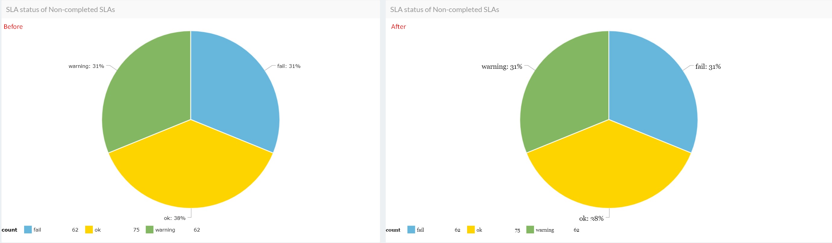
1) You can use the following format to change the font of the legend and labels of a pie chart:
{"fontFamily":"Georgia","fontSize":15}
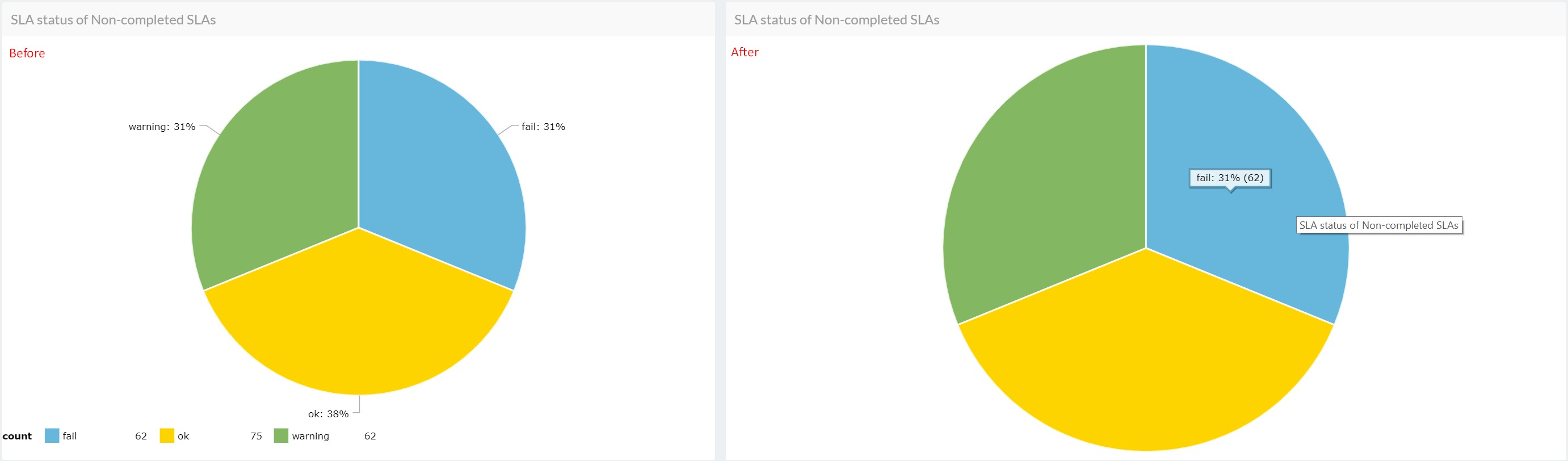
2) Here we are removing the legend and labels from the pie chart:
{"legend":false,"labelsEnabled":false,"categoryAxis":{"labelRotation":45,"title":null}}
Hovering your mouse over the chart allows the details to display.
More information about standard AmCharts options could be found here.
You may be particularly interested in: AmBalloon, CategoryAxis, ValueAxes, AmGraph, AmLegend or AmBalloon.
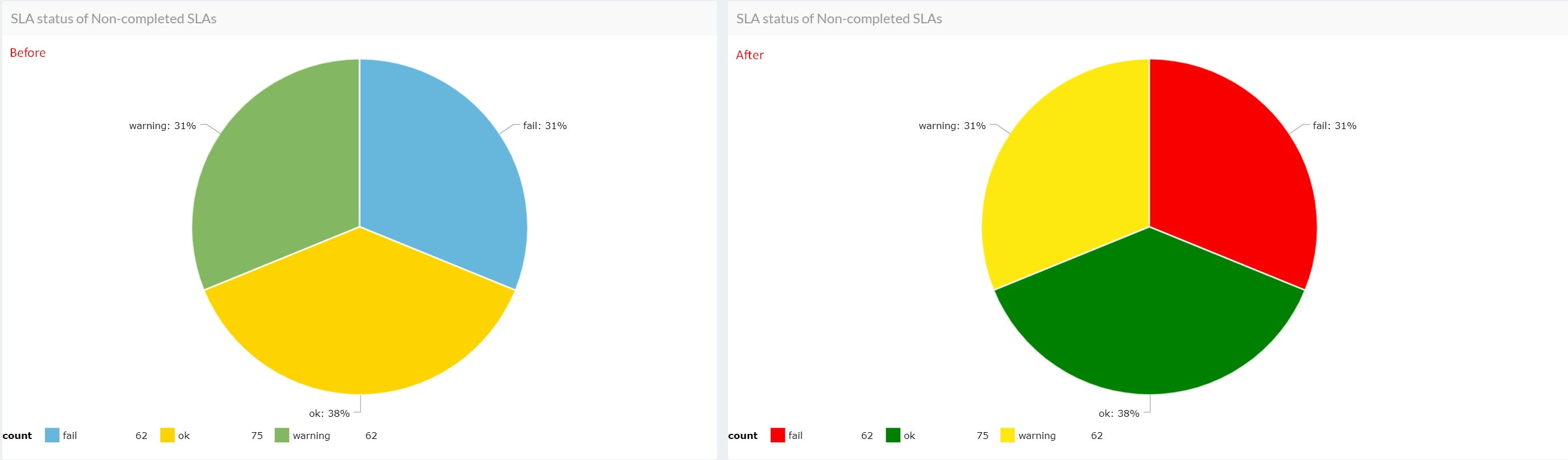
3) In the following example, we have customized the colors of the SLA categories in the pie chart:
{"pieColors": {"ok": "#008000", "fail": "#f80000", "warning": "#fde910"}}
댓글 (2)