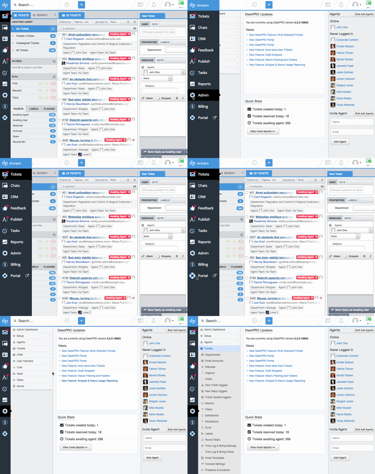
We are excited to announce that the first release of our agent and admin redesign will be available to you soon. We are going to be slowly introducing a new look and feel to DeskPRO over the upcoming months, as we aim to have a new clean aesthetic that improves usability of the platform and ultimately functionality too, as we introduce new features and improvements. We understand that even small product changes can sometimes take a little getting used to, but we are confident that they will improve your DeskPRO experience and we are excited to introduce you to many new features in the new year. Please find a detailed walkthrough of all upcoming changes below.
New Header and App Bar
App Bar
The first big change we have made is removing the separation between the agent and admin interfaces. Unifying the two interfaces means loading the admin section of DeskPRO no longer affects your view in the agent interface. Agents with admin access can simply click on 'Admin' and be in the admin section straight away, making it easy to swap and change between the two interfaces. This change has also substantially reduced loading times across the helpdesk for anyone with both admin and agent access.
We have also taken this opportunity to refresh the icon designs so that they are clearer and more inline with the cleaner aesthetic going forward.

Header
When you first log in you will be greeted with a quick walkthrough guide to show you the ins and outs of our newly updated header. The changes were introduced to accommodate the fact that we have unified the interfaces, which created a need for a more consistent header. Functionality hasn't changed, just the placement and look of certain things and you will now be able to answer live chats, check notifications, search for tickets and create new content while you are in the admin area of your helpdesk.

Profile and Chat: We have moved the profile icon to the far right as this is a more conventional position in a web app and the chat icon follows to the left of this as it relates to your profiles online status.
Views: this remains in the same positions as the old interface.
Notifications: These have been separated from the search bar and moved to the right hand side now as they are not related to search at all.
Search and Recent Activity: This is now accessible in the top left and can be accessed from any area of the interface including Admin and Reporting. Search is no longer linked to just the ticketing interface.
Add New +: This has been moved into the header from the ticketing tab section. Now that the interfaces are no longer separated you can create a ticket, or new content from anywhere in DeskPRO without having to go to the ticketing interface. This will move slightly as other features are added to the header. It will be positioned closer to the tabs in the ticket interface after these changes.

This update will be available in version #5.2 for On-Premise users and Cloud helpdesks will be updated in the near future after the release. We would love to hear your feedback on the new header and app bar so feel free to email us at support.deskpro.com with your thoughts :)


Comments (۳)