We're pleased to announce that we're launching an improved DeskPRO agent interface. We've simplified in some areas and added options in others, all with the goal of making life easier for your agents.
The core goal of the redesign is to make the interface more flexible, by allowing agents to show and hide the different panes. While you could already toggle panes on and off, the new system is simpler and smarter.
You'll still be able to use DeskPRO in the familiar 3-pane view, but the new interface delivers the following benefits:
- Better support for devices with smaller screens.
- Easier to hide information you don't need and focus on getting work done.
- Faster to move through the tickets in a particular filter.
The left-hand filter pane is now collapsible. When collapsed, it will expand when you mouse over it, so you can have quick access to your filters without taking up screen width.
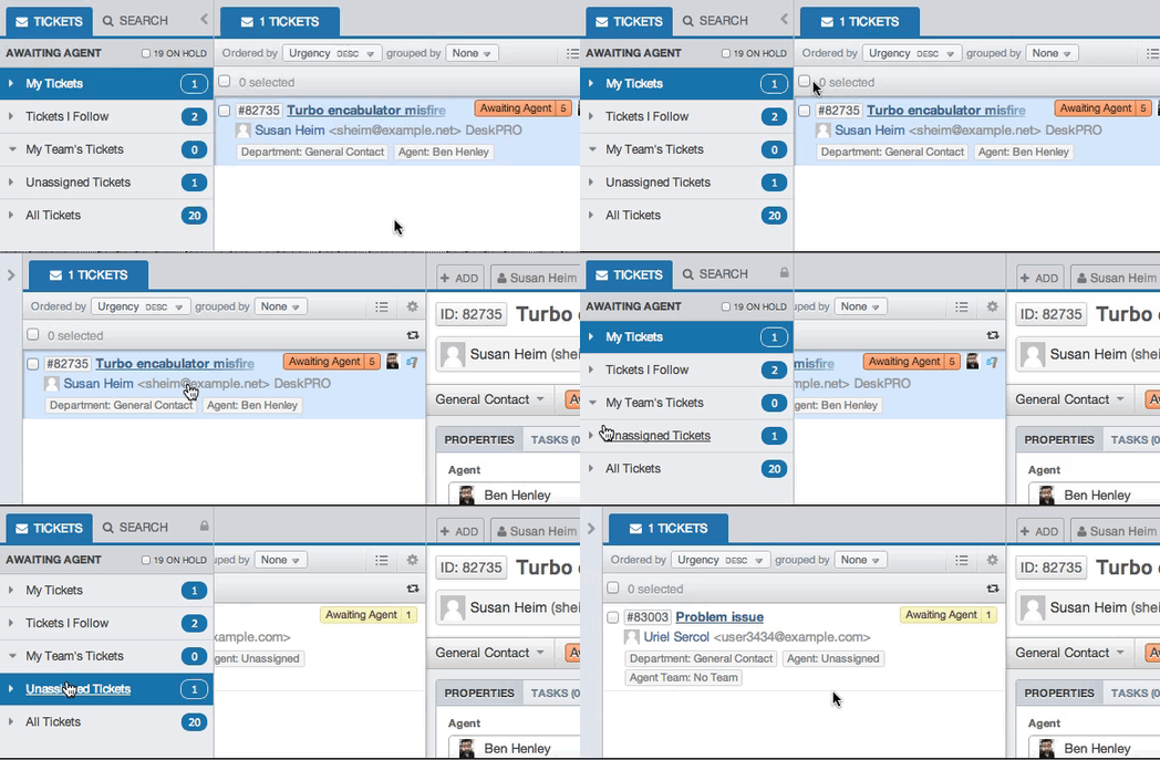
If you want the filter pane to stay expanded like it did before, just click the lock icon.
The rest of the interface can now be toggled between a 2-column and 1-column view.
In the default 2-column view, the list pane and content pane are separate:
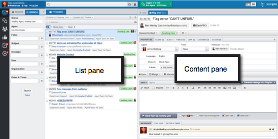
1-column view combines the list and content panes. In this view, selecting a tab displays its contents across the entire column.
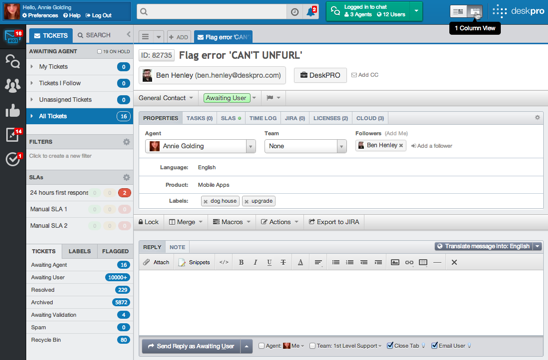
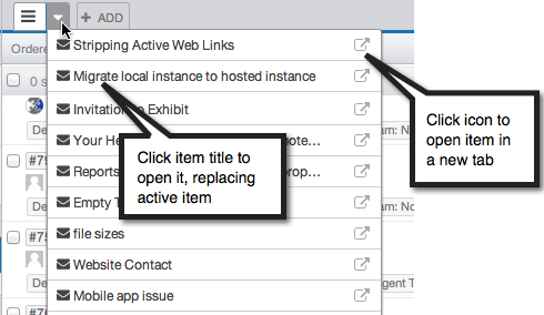
In 1-column view, you can see the list of items from the active filter using the ![]() icon.
icon.
The pull-down next to it gives you quick access to all the items in the list.
Along with the changes to the panes, we've moved the toolbar search bar to a more central position, reflecting that it now offers improved, full-text search due to Elasticsearch support.
We've also integrated the Recent and Notifications buttons into the search bar.

The Create button is replaced with a more logically placed Add control in the tab bar.
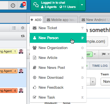
You'll find that new items are now created as tabs, not in a separate pop-up window. We appreciate that in some situations the pop-up had its advantages, such as when you are creating a linked ticket from a chat log and want to see both items. We're working on further improving the new interface to handle those cases.
The table view in the list pane - accessed from the ![]() icon - has been improved. Now instead of opening in a new window, the view loads in place:
icon - has been improved. Now instead of opening in a new window, the view loads in place:
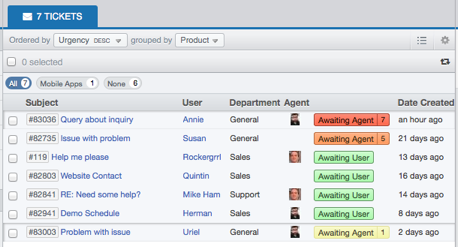
You can still export details of tickets in CSV format: it's now available from the  icon at the bottom of the pane.

